
Making the Book: Oisín and the Land of Youth
- Michelle Carlos
- May 6, 2024
- 17 min read
Updated: Mar 23
Uncover the fascinating journey of creating the art for 'Oisín and the Land of Youth' written by Lesley McCune and published by Oxford University Press. From historical research to mastering two-color art, this blog reveals it all!!

Manifesting your dream project
I'd like to say that this book found me but I probably summoned it to me. It is a direct result of my Hamlet series of illustrations for Folktale Week 2022! It is a clear proof that you should manifest your dream projects through every art you make whether it is personal or client work. These become part of your portfolio, which will help any potential client convince that you can do the job.
I love projects like this! It's mythical as well as historical. It required a two-color palette using Pantone colors, which is a first for me and therefore challenging. The target readers are schoolers, which means I can give it a more serious tone and of course, I get to draw horses—such fabulous creatures!
Oisin and the Land of Youth is a classic tale about an Irish Celtic hero, who visited Tír na nÓg or the Land of Youth, at the behest of a faerie warrior princess in search of a husband. It is the first time I've read about this tale and immediately I was fascinated to learn more about it.

Exploring a new frontier
This project tested me in many ways, conceptually and technically.
Research was essential because I had no idea this tale existed and as always I was very careful to tell a story that isn’t mine.
Because the client was very specific about this, a lot had to be considered in terms of character looks, clothing and architecture. Although fictional, I had to make sure that I represented ancient and Early Christian Ireland periods correctly which spanned the period between 1st to 5th CE.
My research took me from learning more about the legend to diving deep into Irish folklore, mythology and history, to binge-watching Outlander and rewatching for a 100th time my favorite film, Braveheart, though both Scottish, just to have the visual feels of the Atlantic insular landscape and to study cavalry in action, to branching out to Celtic history and European Neolithic cultures. The deep dive to this world was fun! I am actually considering taking up a PhD program in art history.


From watching countless documentaries to visiting a nearby Celtic village and museum in Baden-Württemberg, Germany, minding that the there are distinctions between the continental and insular Celtic cultures, I attempted to absorb as much detail as I could to incorporate into my illustrations based on the art brief for every artwork requirement. I asked what kind of looms they used, textile, clothing, building materials, furniture, daily activities even how they carried babies. How would the villages, houses and people look different after 300 years? What for are those neolithic stones and the carved symbols—are they merely decorative or symbolic? Will I be offending anyone if I simply doodled similar looking markings on the artwork?
The breed of dogs and horses were also considered for I have learned especially that horses are every bit as important to the Irish as their own Celtic heritage. I would find out what breed of dogs they had in this period and in this area? Are they native? How about sheep, dolphins, birds and especially horses? How did they embellish them?
As always, I used Schleich figurines, known for their extensive equine collection, to block the Fianna, ancient Irish warrior clan, scenes while making sure I chose Irish horse breeds through research and with the help of a young friend, who is a Schleich collector and expert as well as a horse enthusiast. She lent me some of her beloved figurines to use as models.


From blocking the scene to sketch to final art
My clients seem to be pleased with and sometimes surprised by my attention to detail. I have to attribute that to my movie-making experience as a director’s staff, a costume and set designer then a matte painter and colorist in post prod. I was trained to think about the logic of things when building a scene from start to finish. And yes, I also studied conservation and trained in research to verify authenticity of recorded histories or provenance of artworks. I never hesitated to question discrepancies between the manuscript and art direction if it will help the visuals.

Music
Did I mention I used music for inspiration? For every project, I always create a playlist that helps set the mood. For this, Enya was the front runner. Her music made a lot more sense now. (In my teens, I owned every Enya album—casette tapes, mind you. I used the music as soundtrack in my school plays.) Obviously long playing Celtic music was on the background but only during the sketching phase. Guess which album was on loop?
The Celts
Much of my research was about Iron Age Celtic clothing. The problem was, the information about fashion when pertaining to the Irish Celts who lived during the period of 2nd-6th centuries AD was insufficient. Scholars call this the dark age of Irish history because of the lack of written records and archeological evidence. Most textiles decomposed except for materials like leather, which made determining what kind of clothing they wore during those times difficult. Very few clothing items were found on mummified bodies burried in bogs. Most historians rely on written records and the earliest illustrated accounts about the Celts.
As an illustrator, I always make it a point to check facts before I start any illustration especially when the client is so specific about the type of clothing, location, culture and era even when it is fictional. When designing clothing, I also need to to consider what made sense to the character I was creating. For example, if the character was on horseback, the clothing must not only be practical but also show the character's uniqueness. Below I explained my creative decision for the costumes of Niamh and Oisin:
I would like keep the scalloped sleeves of Niamh, as it gives an ethereal touch to her warrior faerie princess persona and likewise reflects her otherworldly marine origins. Even though she’s a Celtic faerie character, I don’t feel it’s necessary for her to wear tartan trousers and certainly not similar to Oisin’s because that would seem human-made. From what I gathered, very few humans reach Tír na nÓg. Instead she wears tighter form of trousers, perhaps made of unidentifiable material, and more intricate boots. What I have mirrored between the two are the similar looking armors with the detailed patterns/textures and their cloaks to show that they are both warriors, a common denominator. Moreover, since Niamh’s hair will be in braids, after watching several videos of how long braided hair should move, the movement of the hair against gravity will look much stiffer and heavier. It will not easily flow in the wind or “ripple like the waves” unless she does an exaggerated head flip, body maneuver or it’s magic.

Kilts were mentioned in the art brief but studies showed that the kilt we know today, such as the féileadh-mór (or great kilt), was not invented until the 16th century. Even the best picture winner Braveheart, got this detail wrong since William Wallace lived in the 14th century. What the people of the Iron Age (the period when the Celts arrived and lived in Britain) possibly had worn were wrapped skirts and a kind of tunic or long shirt called leine made of linen and dyed in saffron that produced a yellow textile. Their neighboring island tribes such as the Picts from Scotland might have also influenced their fashion. As someone who also sews clothes, I could imagine how difficult it was to construct complex garments using running stitch with bones and wool thread. I would just wrap the yards of woven textile around my body to keep me warm in those harsh environments! Historians also did not find any connection between the wrapped clothing and the modern kilts. To create somewhat faithful costumes, I browsed through numerous images and academic papers about Celtic clothing, as well as fantasy art and cosplays. However, instead of trying to find out what they wore, I decided and suggested to my client to not draw what the Celts historically did not wear during those times such as the Scottish or Irish kilts.

Of course there are a lot of assumptions here, which is why I took into consideration the type of character I was drawing. Likewise I took a lot of artistic freedom if I felt like the brief did not exactly make sense to the character or the story. For example, the character Una, was described in the brief as Mediterranean (one of the groups of Celtic people that reached Ireland came from the Iberian peninsula) and that she had wild hair and wearing a bonnet. In my mind, if she was this pragmatic and clever woman in the story, I doubt if she was the type who would let her hair loose as she took care of household business, rear a giant baby and manage her giant husband’s ego in a round house built on a windy cliff by the ocean along the coast of Antrim in Northern Ireland. Wouldn't she be more efficient if she just tied her hair in braids? Historically, both Celtic men and women loved to style their hair according to what was fashionable in the tribe, as evidenced by the combs found in the gravesites. Reference illustrations of Celtic women also suggest intricate coiffure. Moreover, visually to me, a woman with bonneted wild hair reminded me of a vegetable brush—not very convincing as a sage! I also suggested that both Fionn and Una should be at most middle aged and not old as was pegged in the brief. They just had a baby and peopled married and died young in ancient times.
When asked if he could read Braille for his blind character, John Malkovich said he didn’t because he thought it was not important and that he did not have the time to learn how to read Braille. His interviewer then reiterated if he would only learn skills he wanted to learn, to which he responded “…it depends on what’s important for what’s going to be seen in the frame.” Obviously I did not have the time to study all about the Irish Celtic culture but only focused on what was going to be seen on the page.
However, instead of trying to find out what they wore, I decided and suggested to my client to not draw what the Celts historically did not wear during those times such as the Scottish or Irish kilts.

Two art styles plus cover art
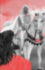
Oisin is a story within a story. He was after all known to be the best Irish poet. In the story, he tells the legend of the Giant’s Causeway featuring his legendary father Fionn MacCool. In order for me to differentiate Oisin’s tale from his father’s tale, I had to illustrate in a different style. I refered to graphic novel and comic art although I did not want it to look too much of a comic book style, because this will not harmonize with the rest of the book, so I had to adjust to remain faithful to my own style. The reds and blacks are more solid here and rendered in high contrast. The Oisin storyline would be softer and have more textures and details to represent "reality".
The interior art were to be printed in Pantone two-color process and therefore require only black and an additional hue, which was red. I immediately clarified if they needed only solid or flatly rendered colors, which was not my style, or if I could play around with values and gradation, since I use watercolors. Fortunately I was given freedom to paint as I usually do as long as the final file is compliant to the printing process. I will go into detail about this later.
On the other hand, the cover art, which was intended for CMYK printing, was rendered in full color. To maintain the overall look with red as dominant color, I also limited the palette with the addition of greens and Naples yellow evoking the art of Nihonga and Dutch Renaissance master painter Pieter Bruegel.

New techniques
The client required only two color, which will be printed in Pantone colors later. I have no experience yet with working in Pantone and even more so with using limited palette and then translating my traditional techniques into a digital format that was compliant to the technical requirements. This was a challenge because I had to rethink my entire process. Initially the Photoshop workflow was not so much of a problem because the client provided step-by-step instructions and we did a test to see if the final art file I will submit was going to be workable. But before I could create the appropriate Photoshop file, I had to figure out how to render two separate colors using watercolors in my style. I am mostly concerned about the gradation and transparency of the pigments but less so with solid or flat rendered colors.
First I looked up artworks using only two colors and the best examples I found were Japanese Ukiyo-e as well as Jugendstil prints as you see in the second mood board above. I also studied graphic novels and a few picture books that have limited palettes. Then I was reminded of an artist, who I knew had her books printed using Pantone, who also works with traditional media, Melissa Castrillon. I enrolled into her Domestika course about picture book making, to learn about her own methods, which was truly helpful, even though she used 3 color and the duotone technique.

Two-color Pantone process
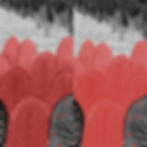
I will explain the new workflow process for two-color art more thoroughly in a separate post, as that will require a longer post. Briefly speaking, a Pantone two-color or sometimes duotone print requires only two inks that are especially mixed according to the Pantone mixing guideline from the Pantone color library. In this case, we decided on red as the second ink color next to black ink. Within Photoshop, the final file for printing must be in Grayscale mode not in RGB nor in CMYK. This means that the Photoshop file will only have just one layer with two channels, the gray channel for the black ink and Pantone channel for the red ink. Now the question was how to execute my artwork using my hybrid watercolor-digital collage technique and then convert into this limited color process.
I had to create my artworks in just reds and grays. To make my life easier, I just used two gouache pigments, vermillion (PR4) and ivory black (PBk1 PBk9) from Schmincke, so I have a consistent red and black paint all throughout. Gouache was ideal because it's opaque and I can have more flexibility in diluting the pigment.
Typically, once I have scanned my watercolor paintings, I work in RGB mode in Photoshop with numerous layers. Once the artwork is approved by the client, I simplify and clean up said layers and then convert into CMYK for the printing file. The Pantone process is entirely different because you are working in Grayscale project mode.
Anyway, this new digital workflow was not as straightforward as I thought it would be despite the step-by-step instructions provided by my client mainly because I needed to retain the textures and handmade look. What irked me the most was the Pantone channel kept producing flat red renders, which was not the intention nor was it reflecting my hand-painted style. If the artwork was purely digital, this process would be easier because you can easily separate the two colors. The art sample in the guide was also flat, meaning there weren't a lot of textures. If you are familiar with my art style, you know that I maximize the amount of details and textures. In contrast to digital art, hand-painted artworks needed to be separated into plates similar to screen printing. Scan each plate and then merge digitally in Photoshop hoping that they will blend in seamlessly.

For this two-color process, in Photoshop you will work in the channels panel not in the layers panel. You are basically working with alpha channels (kind of masks). For more explanation about alpha channels, here's a link. In the meantime, just think of the analog screen printing process. The digital equivalent of the plate/mesh is the alpha channel. In this two-color process, there are two channels: the Gray channel on top of the Pantone color channel. White areas are opaque or masked and the grays to solid black are visible in printing. You can digitally brush over and erase both channels for tweaking. For example, if I brush over a thick black line on the white area of the Pantone channel, that will print red, in this case Pantone 49-7 C. I promise to give you a step-by-step explanation later. Here's a bigger view of the thumbnails:


So I debated if I should just paint entirely in Photoshop but my digital tools were not in top form (more about that later). Full digital was not an option. Following Castrillon's technique, the idea now was to create two plates using traditional media. Think of it like in screen printing. One illustration plate for the grayscale, painted using black pigment, and another plate on a separate sheet of paper for the red areas, painted using the vermillion. Testing Castrillon's technique, I printed out the sketches and traced using the light table. I also painted over the trace emulating comic inking techniques. I normally dislike black outlines but for this purpose, I must go against my usual practice. I purchased a Kuratake Sumi brush-tip pen to allow fine outlining with varying pressure and thickness but with consistent black ink, which I prefer much better than felt tip liner pens.

The red parts were traced on another paper, watercolor paper 300gsm to allow the light to shine through. Although I had to wonder if this will make sense because I had the feeling that the Pantone layer will render flat anyway. Also, once working in Photoshop, you will be viewing in grayscale (monochrome) when working on layers but when viewing on channels, you will see the two-tone image as it would be printed. Should I just paint everything in values of gray using the black paint as did Castrillon? Castrillon traced the artwork on paper three times for every solid color plate she needed. She then made varying marks on paper using monochrome media such as graphite pencils and black markers. In Photoshop she merged the images later and assigned the Pantone color for each plate and adjusted the levels as needed.
However I was confident that I could easily separate the reds in Photoshop using my own hue isolation technique without having to draw and trace three times, which was why a single red pigment was necessary for consistency in painting. I just painted the scene in one go in my style, which also saved me time. I worked first in RGB mode to compose my artwork and then simplified for conversion into grayscale mode for the two-color Pantone process. After several tests from picking the right red Pantone color to getting the right amount of detail and then producing the right file for printing approved by my client, I concluded that the best way to retain the textures was to not make the Pantone channel a solid black mask (see Color test on sketch 1 below). There had to be degrees of variation in the values of the red areas similar to the gray values of the image.
Long story short there was a lot of experimenting done to get the quality of image that I wanted. The images below demonstrate the various tests I made up to the final artwork ready for printing. Note that these are screenshots and not exported files except for the RGB version.


Doubts
As I was working on the artworks on Photoshop to convert the RGB image into a Pantone 2-color image, I was met with inconsistencies and difficulties in maintaining the textures as well as the saturation of the red hue. Obviously my RGB laptop monitor was not calibrated to view Pantone colors, which was why I was second guessing myself all the time. Using a different workflow and technique also made me doubt the quality of the image I will produce. I was experimenting as I went along, which was always dangerous when pressed with time. I couldn’t help but wonder if my hybrid style, which was heavily traditional, was even suitable for a 2-color Pantone technique.
I could not achieve the image that I envisioned. But after several attempts and hits and misses, success was achieved with persistence. I was happy with the end results.

When technology fails
This book project was different since I had to change my workflow that would rely so much on digital techniques. But just as when I thought I could rely on the advancements in graphic design technology, it failed me. My 4-year old Intel MacBook Pro was also dying and that made this project even more painstaking. I was holding my breath all the time while working on this. I was making backups every time I finished an artwork.
This forced me to upgrade my workstation, which also changed my digital workflow. In the beginning I intended to do the coloring digitally but the latest update in Mac OS Sonoma somehow messed up my Wacom tablet, whose manufacturers did not update the driver right away, all the more preventing me to do the digital coloring. It was easier to isolate the red color this way. In the end, I reverted to my standard hybrid workflow, which was a much slower process that ate up what was left of my already tight schedule.
However, I needed to cut down a few steps. Thanks to a 10 year old light board, I was able to skip tracing on paper. It was also holding on for dear life as it kept flickering. I also sacrificed the paper thickness, to let the light shine through. I normally use 600gsm but opted for a 250 to 300 gsm watercolor paper instead. I worked in the dark to optimize the light from the board.

Fortunately the new and more powerful Mac work station (Mac Studio Max) and LG Ultra Fine 5K monitor arrived a week before the deadline, which allowed me to fast track the digital process. I was able to breathe at last and at the same time appreciate the bigger view of my artwork.
The problem with older hardware is that software updates come much faster and the processors can only keep up to a certain point. Corporate greed from PC manufacturers also prevent any consumer to hold onto their computers for life—because hey, you need to purchase new ones every 4 years! Contrary to what is marketed that your Macs are built for life, expect that at some point these rather luxurious gadgets will need replacement. (I will save the discussion about PC preferences later.) This means you need to be prepared in case of tech fails and always have back-ups not only of your digital files but especially also of your entire computer.

Always ready
Whether pushing for an idea you believe in to make the images stronger than what was initially intended, or making decisions to make your workflow more effective, you have to be relentless and be prepared to defend your creative decisions. You push through the challenges and learn from the entire experience. After all it’s all about the pictures you deliver that matters. What happens behind the scenes is inconsequent. You must meet your deadlines no matter what. Nevertheless the complex art process always makes a good story to tell and a great source of education for you and me, yes?
In the end, my clients in Oxford University Press were very happy with the final result without requiring any more revisions and sent me this generous feedback to keep me going:
Dear Michelle,
The editorial team also wanted to pass on an additional note of thanks to you, for all your hard work and meticulous research that went into creating such fantastic illustrations. They’re filled with life and movement, but also reflect all your thoughtful consideration of the mythical time period and location, so we’re hugely grateful! Thank you so much for putting so much effort into the details that really make an impact on the reader’s experience.
Oisin and the Land of Youth is written by Lesley McCune and published by Oxford University Press on June 24, 2024. You may pre-order the book here.