
Making the Picture Book: Lullaby for the King
- Michelle Carlos

- Sep 9, 2023
- 15 min read
Updated: Mar 23
In this post, you will learn about my process, the extensive research as well as how I tapped into my juvenile art-making style to bring to life this awe-inspiring picture book written by award-winning author Nikki Grimes and published by Beaming Books.

A dream project
November 2021—As soon as my Astound champ agent, Tina, sent me the email—a direct inquiry from a potential client, who would love to work with me on this book project, my heart fluttered with excitement. First, because it was flattering to know what a direct inquiry meant (it means you are one of the top choices, if not the first choice, among a line-up of potential artists) and second, the plot sounded like the perfect kind of story I wanted to create. Any tale that calls for magical realism was always attractive. Also the schedule fitted and so it was a 100% yes for me.
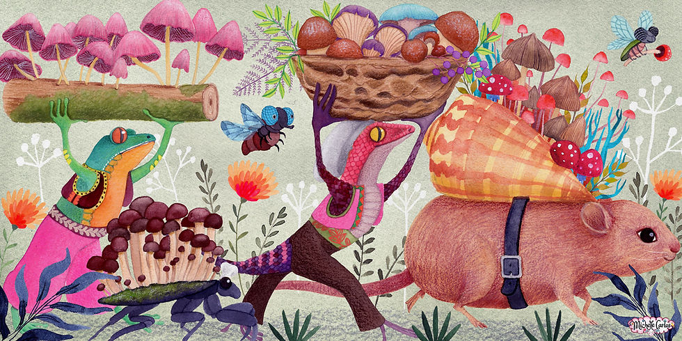
The book is a lyrical, folk-tale style story about animals coming from far and wide to bring gifts to baby Jesus. I’m really drawn in by Michelle Carlos’s artwork and I think she would be perfect for this story! It has the mystical, dreamy quality we’re looking for along with spectacularly detailed animals. - Naomi Kruger, Senior Acquisitions Editor, Beaming Books
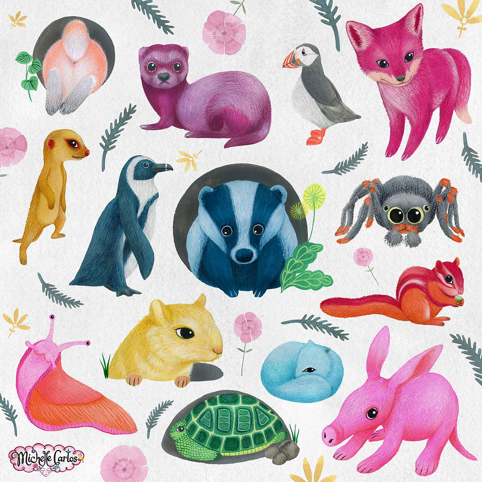
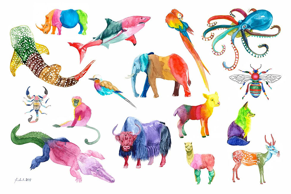
It was also particularly noted that they would love the animals to be colorful. Wait, what? That is my thing! I have been coloring my animals unrealistically since I discovered crayons! My nursery teacher sat down my mom to express her concerns about my strange coloring technique. I believed I could really make this picture book work.
Come to think of it, most mammals are muted colors for survival purposes. It was tricky to assign each color without making the page look like a child’s coloring book. Even though I was asked to use jewel tones, I was conscious in my choice of a sophisticated color palette that was not too Christmasy.
But first, I had to find out more about the animals that would join the caravan to Bethlehem.
Discovering ancient Palestine
You might wonder how on Earth did these animals become part of the Nativity scene? A lion, a leopard and a hippopotamus all bringing lavish and humble gifts to the newborn king? Well, it all came from the genius of the author, Nikki Grimes. The premise intrigued me straight away but the manuscript drove my mind wild with imagination. I was going to draw a lion!!! But wait, were there really big cats in the region? Although the text mentioned what type of bear and lion came to visit the Holy Family the day after the birth of Jesus, I had to find out the exact species that might have roamed the desert landscape.

The art direction specified that we keep the landscape, gifts and animals true to the geographical location and period as best as we could, which was 1st century Palestine. I went straight to the books to research and googled my way to find the respective animals and gifts. I also traced the path of the caravan on a 1st AD Palestine map and devoured documentaries about life in that area in that era as well as binge watched Nativity movies. For a minute I was even tempted to fly to Israel and take a trip to Judea but opted to just watch 4k flyby drone shots over the region to orient me with the landscape as well as where the sun sets relative to the trail of the caravan. However during my brief visit to Copenhagen, I purposely went into the National Museum to see a full skeleton of an aurochs (because this ancient bovine species still existed in that time) just to get a comparative idea of its enormous size.

As usual I collected Schleich animal figurines as my drawing reference for proportion and perspective. I would line them up on the floor or on a pile of pillows and blankets to stage the caravan's traverse on various terrains. I put my filmmaker hat on and photographed them in certain angles to pre-visualize my blocking and composition on the page.

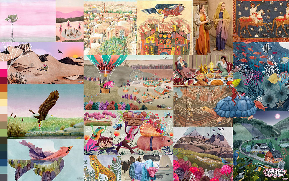
Moreover, my several safari trips around South Africa provided me with countless pictures of animal herds against vast landscapes together with lions and leopards just a foot away from my face and likewise my brief sojourn in Dubai also aided in capturing that desert-living vibe and of course the atmospheric photographs of sand dunes and regional foliage I have collected all became great visual references. I referred to old paintings of Bethlehem as well as 20th century photographs of the Holy Land and its peoples. As my ultimate visual peg for the look and composition, I took for inspiration the 2006 cult film, "The Fall" by Tarsem. I wanted to create double page spreads with cinematic and dramatic landscapes in varying perspectives and flowing movement as the story built up to the final scene we all know too well.
Following the manuscript, I also presented a list of the animals that I believed existed in that time together with the gifts that came with them. The books in my own personal library about historical Middle Eastern and Central Asian art and antiquities, textiles and clothing came in handy to help me with the design of the costumes and gifts. It should be noted that the gifts featured were only assumptions based directly from the manuscript. I had to guess a lot, for instance, to which dainty vermillion vase the author was referring or what kind of wild flowers grew in the region. I had browsed through online catalogues of Roman, Egyptian or Middle Eastern antiques and archeological artefacts that were produced around that period. Once I have gathered the potential gift items, I had them checked by my editor before I could go ahead and start sketching.
Let's begin
Part pressured and giddy, I wanted to start the illustrations already way ahead of the original plan and because I had another project that conflicted with the schedule. To prevent the stress from working on two books at the same time and because I already knew how working on three books simultaneously affected my health, I coordinated with my agents and clients to make the schedules for both projects manageable.
Because the story was so beautiful, it was a breeze to start brainstorming. I was so inspired and ideas were flowing like crazy. I wanted to contain that energy as long as I could before the other project came in. After my intensive research on the animals and the gifts and putting together the mood board, I started with the three cover art concepts and then proceeded to the thumbnails that became a full storyboard so I could discuss my ideas to the editor much earlier in the project calendar. I also provided a presentation of my concept, palette and references so we would have a clearer vision of the epic book.


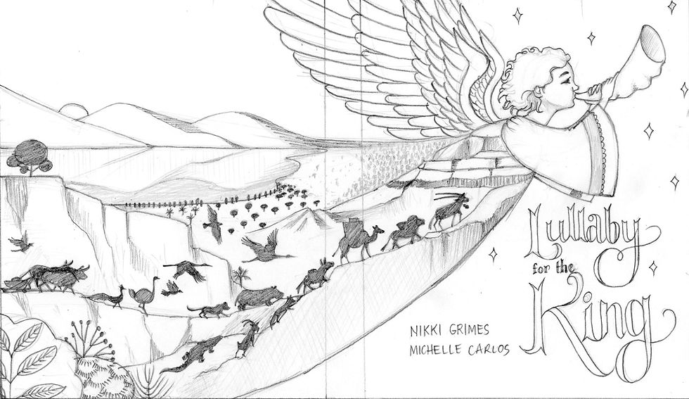
Cover art concepts: My general rule is first, propose an obvious/safe design, then something I would really love to make and then another option that is completely out of the box.
Sketching
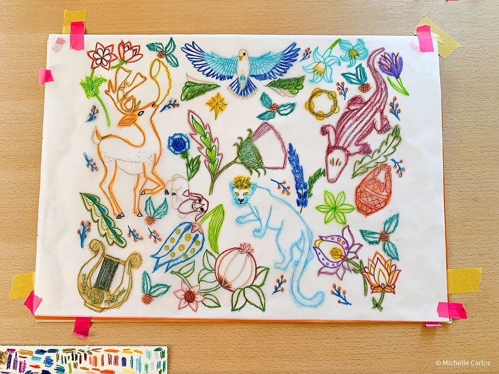
For this book I employed three stages of sketching. To quickly flesh out the ideas, I made literal thumbnail stick drawings onto the printed manuscript. These doodles were for my own eyes only. Truth is my rough sketches were detailed already because my ideas were too clear in my head and I was also afraid that my real thumbnails were too cryptic.
These rough sketches were presented to my client as a storyboard while we discussed about the initial art direction. After some tweaks, I submitted the refined official rough sketches for a final review prior to coloring. I labored so much on the sketches because one, I am a perfectionist and two, not only do I trace the sketches 1:1, I also know I could utilize them in the final art especially when intricate elements such as textile patterns are involved that I did not want to draw again from scratch to save me time. I also dislike repeating any drawing except when tracing.
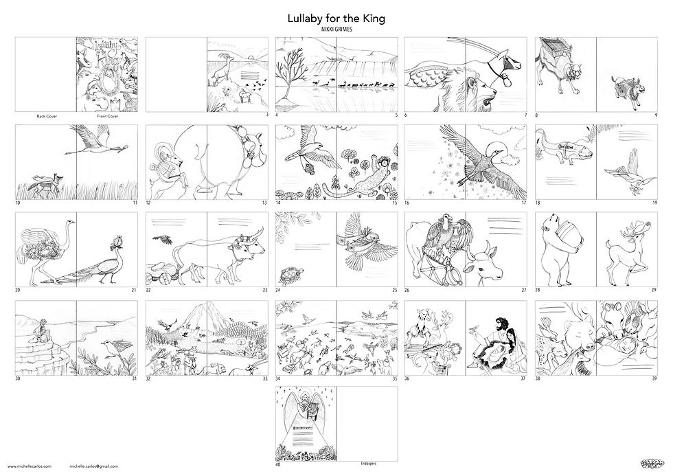
I really did not mind laboring on the sketches because drawing is the basic language of all fine art as well as design disciplines, right? Everything starts with line drawings. It also reveals the fundamental skills of the artist. At the same time, I wanted to show first the sense of the scene sans color.
But of course, second guessing my creative decisions was a given. When in doubt I always lean into my favorite artists’ sketching process for guidance.
Isabelle Arsenault explained her sketching habits on making “Jane, Fox and Me”:
I developed my sketches quickly at a small size, directly onto my copy of the manuscript. I am quite the perfectionist: so much so that if I applied myself to my sketches as I do to my final renderings, I’d waste a huge amount of time. The book cover, for example, was doodled quickly. Later, I had the idea for the colours and I scribbled them on my phone. These little visual notes have very little detail, but they are enough to guide me in my work.
Meanwhile, Carson Ellis described how she did the sketches for “Home”:
I told Liz and Kristen that, for efficiency’s sake, I would do really fast, loose sketches. I was pregnant and working on the third Wildwood book at the time and just wanted to quickly flesh those thumbnails out into something more detailed before I had a baby and all hell broke loose. But once I started sketching I felt mysteriously compelled to do the opposite: to labour over each sketch. I spent eons on the sketches for ‘Home’. I sketched forever and ever.
Next steps
Tracing is my answer to getting all the elements in the right proportions and positions on the spread. You may argue that a light table would make my work easier but since I always use both sides of a 600 gsm watercolor, it was too thick for the light to shine through to capture every fine detail.

The background landscapes were also painted in advance because in my experience so far, clients did not comment much on the landscape except when they reminded me to be careful with the textures against the text. In Photoshop I put a black and white adjustment layer to make the sketched spread monochromatic and then just delete this layer for the final colored art. This way, a large chunk of my work in building the scene in color for the final art is done.
Painting the landscape background also showed the textures especially the atmospheric feel that I wanted to achieve on the entire spread. If there were revisions, these were either done traditionally or digitally, which was preferred for practical reasons and as long as these were minimal. Once approved it was straight to coloring already.
"Technicolor" animals
It was tricky to choose the hues of each creature. Which color would fit the animal and at the same time look good when paired with the other one? To test the colors, I went over to Photoshop and played with which jeweled tones to assign each creature. Then I applied the colors on each animal using colored pencils on the printed storyboard to preview the pairing on every spread.

As mentioned, I was fond of multicolored animals but this time there was so much consideration to be made in terms of color variations, contrast and palette. The animals were carrying gifts and so I had to make sure that the gifts would also stand out against the plumage, the fur and the background. For example, in contrast with the gigantic aurochs, the raven appeared much smaller on the page and it was supposed to be carrying a ruby ring in between its wings. Ravens are black and ruby is red. To maintain the value of black, allow the red ring to stand out and at the same time keep the hue within my palette, I chose dark green for the raven. The composition had to be considered where I placed the raven within the page for maximum visibility. This would mean placing the bird on the bottom right foreground of the spread. One decision factor was to choose colors that are the opposite of the natural hue on the color wheel. Most animals, mammals particularly are dull, ranging from browns to grays. The opposite of brown, which is basically muted reds and oranges would be blues. So I ended up having a lot of blue animals as well as purple ones.
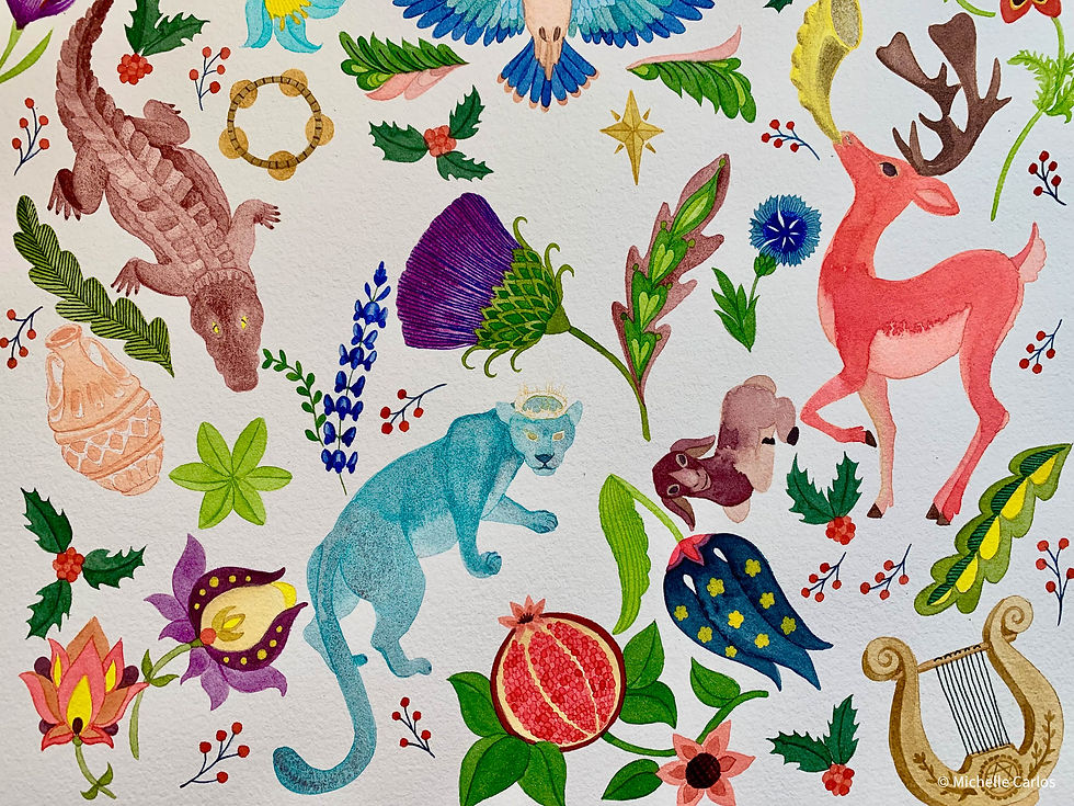

The mood board was particularly helpful because it kept me anchored except for the usage of mint greens and purples that were not in my original palette but rather a spontaneous creative decision. Nevertheless I wanted the colors to either harmonize or complement each other. More often than not, I would manipulate the colors in Photoshop. This is why painting each animal separately became useful. Isolating each element made color tweaking much easier.
I would also view the colored spreads all together as a digital contact sheet so I could see the overall look, continuity of colors and the flow of the composition. If one spread stands out from the rest, I would then go back to Photoshop and color grade.
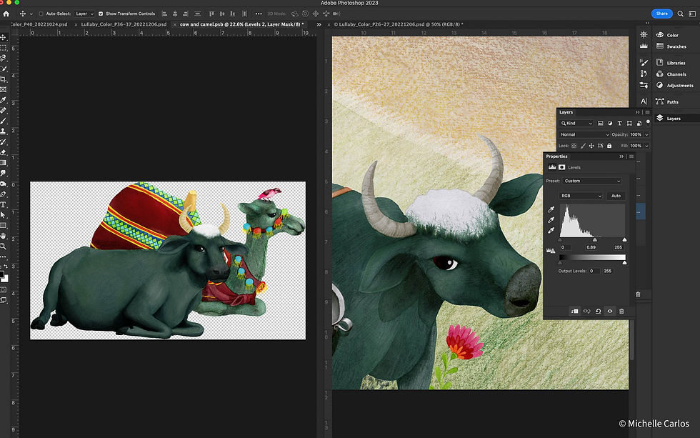
The problem was that some animals were TOO colorful and I knew it as soon as I hit the sent button for the final art review. The editors and author agreed and asked to tune down the colors. I expected as much but I just had to push to see how far I could get away with my unconventional coloring. It was a technique I always did as a colorist in post production. If the art director, cinematographer or director wanted bright colors, I would saturate colors up to a certain broadcast legal point until the client asked to dial it down a notch. That way they could see right away that I made some color correction as supposed to subtly turning the knob to adjust. The reason is our eyes adjust to color/light quickly that subtle adjustments will not be noticeable. Think of it as shocking the system. (Apologies for the grading jargon!) Technically it was easier to desaturate than add colors that were not there in the first place. It was much easier to tweak colors with the basic knowledge of HLS adjustments and keying than repaint either by traditional or digital means. This is especially true when working with scanned media. This is the reason why working with layers is crucial. I always anticipate revisions that is why I plan ahead and work in layers. Having a hybrid workflow eases the work load when working with traditional medium.
The color changes made a lot of difference in the overall look of the book.

Interior art conundrum
I was feeling stuck with one scene, the epic rush of the caravan to the gates of Bethlehem. This scene was clear in my head but somehow it felt like I could still improve on my original idea. My instincts told me that the hovering angels in the distance felt cheesy so I explored further. First, I looked up how angels were depicted in Judaism (more about my problem with angels later). And then I searched for animal caravan scenes such as the stampedes from animal documentaries to the Lion King and live action Tarzan movie just to study the art and physics of the commotion. As an illustrator, one thing to look out for are the verbs used in the text: "The creatures rushed through Bethlehem's gate." They did not parade. There was urgency and excitement and they were carrying gifts that may defy the laws of physics. Even though this is still fiction for children, I had to think of ways how to securely mount the cedar chest on the camel and show the zither at the same time, or make the bear carry the water jugs the size of boulders and supposedly made of clay while it pounded through the wilderness. Not to mention, the extremely wide scene included animals and birds of different shapes and sizes as well as modes of mobility. How to give each animal justice and show them all in a double page spread?
Exploration also meant going out of my comfort zone. Whenever I'm out of ideas, I always revisit my favorite artists’ works, both kidlit and fine art, to look for solutions but to no avail. Instead, I discovered the duo artists, It’s Raining Elephants and their book, Die Große Flut, wherein they created a grand scene of animals rushing into the ark. The picture they created taught me how to compose this chaos on an 18x11 inch spread. I simply needed to overcome rational thinking!
I love it when all the dots are connecting to get the best solution.
Angels
I struggled with creating the angels. First of all I did not want it to look like the stereotypical Christian angels because this is not your stereotypical Christmas tale. The author and editor also strongly felt we should veer away from the soft and pretty renditions of angels and yet my initial drawings kept on leaning towards the popular style because that image of a winged human-like heavenly being was deeply ingrained in my memory growing up as a Catholic. Yet again I had to look to another direction and dove deep into the history of angel depictions in Judaism, Islamic, Byzantine and Christian art (which all based their depictions from Greek and Roman winged messenger gods). None of those helped erase my visual vocabulary of those celestial beings.
The author suggested not showing the faces and making them look more fierce and powerful. Likewise, there was no clear description of angels anyway, biblically speaking, and so I heeded the non-specificity. My editor also sent me samples of contemporary angel artwork from which I could draw some inspiration.
“We can't solve problems by using the same kind of thinking we used when we created them." - Albert Einstein
This time I reverted to Klimt’s artworks for who would connect angelic figures to his repertoire of femme fatales, right? However I was reminded particularly of his Beethoven’s Frieze, which lead me to searching for Nihonga, because Klimt was largely influenced by Japanese woodcut prints, then towards the more modern manga art and then a full circle to my own style of art. The result was a choir of enigmatic human-like beings with plasmatic heads and ghostly figures wearing Palestinian inspired garb as you would see in the board cover art at the end of this article.


Nitty gritty
There is always an ongoing internal debate with myself on whether I should render with details or just let it be especially when resizing was involved. I have painted each animal individually at 3x the print size so I could produce the texture and details that I wanted. Was it worth all the effort knowing that it was going to be printed on a 9x11-inch page while I considered my deadline? Surely skipping the tedious rendering would speed up my process. But my maximalist side always won. In the end, I just wanted my pictures to look great and I would not be able to live with myself if I was too lazy to add a strand of hair or plumage to my characters.

At the last minute, I was asked to change the Holy Family from Middle Eastern to African. My mind raced with a thousand questions mainly about the specific African look of the family that my client wanted. Repainting was no trouble but was the look in terms clothing and hairstyles of the family going to be 1st century (since all of the gifts and animals, landscapes were more or less around the period of 1st AD) or contemporary? All felt dumb questions but I had to ask anyway to be sure. It was also already around Christmas 2022 and I was fortunately in Paris that time when I received the request, where I immediately observed African-decent passersby to study their facial features, skin tones and hair textures. I had no sketchbook with me so I had to stare quite long but ever so discreetly! With blessings from the author, it was decided that Mary was to have braids and Joseph a shorter afro. Baby Jesus remained as is. To understand the logic and weight of such hairstyle, I studied how box braids and passion twists were done and even tried it on my own fine hair!
Collaboration at its best
As an illustrator you tend to work solo for months with the occasional follow ups or interaction with clients kept to the bare minimum. If a single page was a scene in movie, you are the director, cinematographer, actor, the whole art department and post production staff in one go. My editor, Naomi, was on board from brainstorming up until refining the final art, which was a great help to tie up loose ends in the entire process. As you may have gathered from this account of this book's behind-the-scenes, there was so much involved in creating the 40+ epic pages. Admittedly, I sometimes have the tendency to hyper focus and therefore miss a few details here and there or even fail to see the bigger picture. So it was always good to step back a little and survey the final product with the help of the entire publishing team involved in making this picture book. Nikki was also always there to give her valuable insights.
If a single page was a scene in movie, you are the director, cinematographer, actor, the whole art department and post production staff in one go.
All in all, this was such a wonderful collaboration that also challenged me to go over and beyond my usual techniques as well as question my own visual language of the story of the Nativity. It was also amazing how my juvenile artistic style made this project possible. The client loved how I rendered my animals and how unrealistically colorful they were, which was how they wanted the animals in the book to look like. It really was a perfect match. What makes a great project for me is that which I always came out learning more than when I began working on it for an illustrator does not simply create pretty pictures but also dive deeply and carefully into research in order to tell an honest story regardless how real or fanciful it may be.
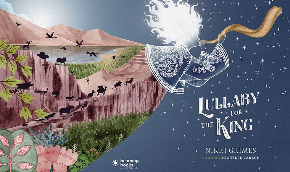
Lullaby for the King is an awe-inspiring Christmas tale from multi-award-winning poet Nikki Grimes and published by Beaming Books on October 10, 2023. Head over to their website to grab your copy.


Comments