
How to Make the Book Cover Art: Past Watchful Dragons

Updated: Aug 6
This post will explain how I designed the award-winning book cover art and illustrations for "Past Watchful Dragons: Biblical Stories Retold."

Book cover art is the easiest job
There will come a time in one’s professional career that a project will be just right. Making Past Watchful Dragons especially the book cover art was a treat! First of all, the intriguing title alone and knowing that I will be required to illustrate dragons and lions were enough reasons to agree to a book project like this. Even though many moons have already passed, notwithstanding my recent health crisis, I can still remember happy thoughts and feelings while working on it.
It was a direct inquiry, which meant that the publishing team saw something in my portfolio that specifically convinced them I was who they were looking for to bring this book to life. On my end, it was a privilege to have been able to collaborate with such wonderful people in the business of children’s books publishing.
Immediately we scheduled a video meeting with the entire creative team to discuss our collective vision as well as exchange ideas. They’ve highlighted a few of my artworks that stood out and perfectly aligned with the artistic direction.
I was asked to create 12 illustrations for every short story, an endpaper artwork and two book cover artworks for the dust jacket and hardcover that featured a dragon. What I needed to consider when drawing the dragon was that to make the eye as a focal point and the definition of scales. The designer wanted the scales to be embossed and the eye to be laser cut to reveal a second cover artwork, the hardcover, as part of the book design. With these information, I began my research and brainstorming.

Playtime!
With the laser cut and embossed cover jacket in mind, I looked up at existing books that had the same treatment just to wrap my head around the concept. Since the book itself is just nearly half the size of a typical picture book, will I have enough space on the cover to show all of that and how will I design the dragon? Since it was still a children’s book, it should not be too terrifying even though the dragons in the stories were almost always evil. I wanted the dragon to still look benevolent and bendy. As always I got myself the perfect excuse to collect dragon and lion toy figures and display them on my desk similar to how my former CGI artist colleagues in my previous life used to decorate their two-monitor desk set-up with their collection of toy figures from popular manga, anime and comic characters. I also watched movies with dragons and created a playlist from the soundtrack of those movies just to set the mood.
What actually inspired me to create the cover art was the handmade 3D dragon journals with a glassy eye splattered all over Pinterest. That was the starting point and what came after was playtime.
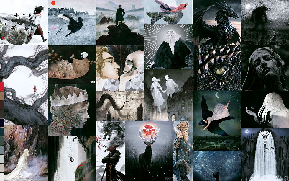
Next in my agenda was to create the mood board inspired by my older Folk Tale Week illustration series that the clients pointed out. It was going to be dark, moody, and almost monochromatic with pops of red here and there. I was asked to add a greenish undertone towards the later stage so it wouldn't be too black and white.
Since the short stories were not only a retelling of Biblical stories but also specifically inspired by folk and fairy tales from various countries, I also looked up cultural influences to stay true to the author’s intention. The architecture, costume and physical features were carefully considered. I traveled the world and back in time to get the details with a twist right. While I have drawn inspiration from the costumes and architecture of the geographical locations mentioned in the brief, I chose not to prioritize accuracy and authenticity. After all, this was the fictional world of Erith. For example, the king's robe in "The Proud Princess and the Reluctant King" was inspired by an 18th century banyan designed by an Italian tailor using silk from China with the dragon emblem. The short story was not necessarily a Chinese-inspired tale but I just love the symbolism of the dragon robe, noting that gold and dragons with five fingers symbolize the Chinese emperor. Moreover I was able to use the robe's ornate design elements as a device to show how the love of the king for the princess blossomed in stark contrast to the modesty of the princess' clothing.

Although, I must admit that I had a bit of reading side quests from Norse folklores to Byzantine tales to Japanese legends. I added African-inspired attire for the Loreman character, as I found that missing in the list. African cultures are deeply rooted in oral traditions, echoing the narrator of the tales in this book, and of course, we can all trace our origins from that part of the planet. I've also inserted Easter eggs in all of the artworks just for fun, particularly concealed dragons not mentioned in the story.
Experiment
The number of artworks required and the period allotted to work on them allowed me to experiment on my hybrid techniques a little. I was also given freedom to explore the world building and one-page artwork. The client asked me to decide on which scene to choose based on what inspired me the most, which I love as an illustrator!


As for the dust jacket cover artwork, I presented a couple of ideas. Once the concept was approved, I proceeded to execute my planned attack. I needed the dragon to be luminous—almost ghostly but painted traditionally. I figured that if I painted the contrasting color, when inverted in Photoshop, it will create that ghostly effect. So I tested a few tints and shades of magenta and purples to achieve the green dragon scales I was aiming for. I was basically painting in negative, which means, the light and shadows are reversed. I had to constantly remind myself from where the source of light was coming. It was also crucial to use the same paper grain and weight to anticipate pigment texture when scanned. Once painted in sections, I assembled the dragon in Photoshop and inverted the colors. Further enhancements were done digitally to finish the cover art. In order to understand the process from painting to photoshopping, watch the video above.

It was also my first time creating a fantasy world map as is typical of classical tales. This will serve as the endpapers artwork. The author provided her version of the map of Erith, which was quite helpful in imagining the geography. I took the liberty to alter a few elements so it won't be cut along the gutter. I then acquired a pigment pen brush to be used for fine line work and lettering. That way, the ink would be more consistent than watercolor paint. I did not have to dip my brush every now and then. The pigment ink did not bleed as well, which made digitizing a lot easier.
Tip: Only experiment with techniques when absolutely necessary and when time allows.


Rough composite sketches of proposed cover artworks
Initially the dragon artwork was intended to be the hardcover but the art direction changed and it was decided to switch it with the proposed dust jacket artwork, a landscape with a lake the shape of the dragon’s eye. To create the artwork, I had to ensure that the dimensions are correct and would align perfectly with the laser cut dragon's eye on the dust jacket. I also needed to hit several story points in one stone without revealing so much the plot. The idea was to hint the Loreman’s journey and the impending encounter with a malevolent being, which ties in with the illustration on the first tale of "The Loreman, the Star, and the Terrible Word."
The lake-eye sketch was ultimately chosen, which then allowed me to continue with the dragon sketch. The landscape also must mirror the shape of the dragon’s eye from the dust jacket, suggesting the creature’s omnipresence. The trees also imitate the scales. If we had followed the original concept, we would have first seen the landscape on the dust jacket and then revealed the hidden dragon on the hardcover. Good thing I also had the sense to make the designs interchangeable just in case by making the artwork extend enough beyond the bleed marks.
Fun fact: The jagged mountain scape shaped like the dragon's brows was actually inspired by the lahar mounds along the treck to Mt. Pinatubo's crater lake, a volcano not far to my hometown.
The reason I painted in sections was purely practical. It would be much easier to adjust the composition in Photoshop when elements are layered as foreground, middle ground and background. In the two process videos here, you will notice that I have been nudging each element ever so slightly just to get the perfectly aligned layout. This also allowed me to match the eye on both cover artworks. The book designer himself had a bit of challenge on the production side and decided in the end to scrap the embossed dust jacket concept and just have a hardcover with the dragon artwork, laser cut the eye and then move the landscape artwork on the endpaper instead of the map of Erith, which I personally approved as well. I imagined getting this to match exactly would be technically tedious. Most readers, including myself, set aside the jacket anyway while reading. The downside of this change of art direction was that both cover artworks were cropped to fit the new dimensions—all but negligible concerns of mine as the artist. In publishing, one must learn how to "kill your darlings." I love how the final book cover turned out and it really makes you intrigued—or so I've been told. Did I mention I love gold foil?

"Kill your darlings, kill your darlings, even when it breaks your egocentric little scribbler's heart, kill your darlings.' - Stephen King
Not perfect but good enough
When the author pointed out that I might have misunderstood the scene in the story of Wistan where his heart was removed from his body but was not pinned to the ground, as I have initially sketched, I had to reread once more to see how I had missed this detail. Somehow this image of Wistan lying on the sandy shore with arms widespread and the upright sword both mirroring Christ on the cross was stuck in my head all this time. The team however found my illustration gorgeous and loved how I brought the symbolism of the cross through the sword but was afraid that my interpretation was far off from the text. My solution was to keep this image but instead of showing a solid human figure of Wistan, he would appear as a ghostly figure with his actual heart pinned by the sword on the ground without explaining so much visually that his physical body had died. That way, we could keep the minimalism and especially the crucifixion symbolism, “the ultimate act of sacrifice by Christ to rescue his bride, the Church.”

Finally, as I was going through the finished colored artworks, I began to question if they were harmonious. Although each story took place on a different geographical location and even timeline, I couldn’t help but wonder if they look like they belonged in this fantastical world or more importantly created by one illustrator? In the end, I realized that I was being a perfectionist once again. I also realized that the kind of projects I really enjoy are the ones where I was given creative freedom to explore. This is crucial information to remember when considering projects in the future. What was also truly rewarding in this whole process, despite a few hiccups, was that the client, the creative team, was not only happy about the final artwork but also about working with me. It was definitely the kind of collaboration any artist would dream of. I was grateful to the team’s openness to my ideas, their generous feedback and the trust they gave me to pull this through.

Past Watchful Dragons: Biblical Stories Retold was written by Rose John Sheffler and published by Word on Fire. It won the CMA 2026 Book Awards for All Children’s Books (1st Place), Children’s Independent Reading (1st Place), Design and Production: Children's Book (First Place), Front Cover Artwork (1st Place), and First Time Author: Children's Book (Second Place).


Comments