
Marching to the Beat of My Own Drum
- Michelle Carlos

- May 29, 2021
- 12 min read
Updated: Mar 23
In this post I share with you my experience in participating in this year's Make Art That Sells Illustrating for Children's Books course: why I struggled with my characters yet again and why I decided to do this course in my own way.

The Story
Each ICB is a different story. That is, the experience is always different. To be honest my excitement from the last two ICB stories I chose was incomparable to this year. My energy and drive to create was low and I will initially blame my fluctuating hormones, HRT drugs and foggy head. Amid my ongoing health issues, I trudge on.
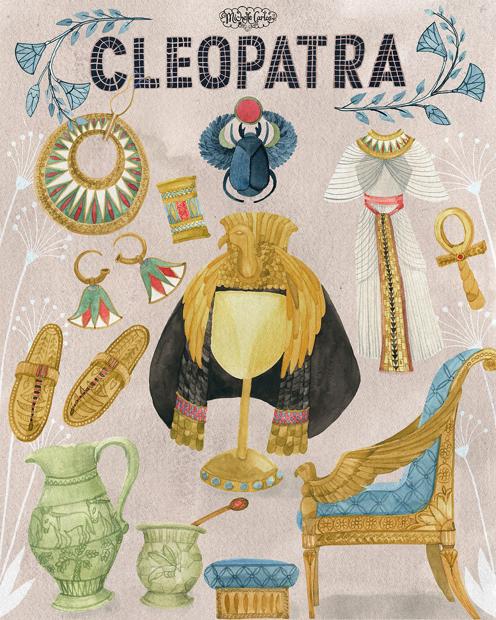
Of the three stories, the title “Cleopatra and Mr. Tibbles” intrigued me the most and so I read it first. While reading the text, I was already imagining the setting. In art school I have created an Egyptian themed interior of a soap shop and that came into mind right away. Also I have been finding a solution in how to incorporate my abstract style into children's book art. In addition, I have been wanting to draw historical figures and people to focus on a character-driven story. I also knew that I will be most challenged by this text. Everything about it fits my goals for my third run in ICB.

Escaping the Rabbit Hole
I dove right into heavy research and discovered that what we know of Cleopatra in popular culture is not even close to the real one in the history books—at least in the physical appearance aspect. She was Macedonian in heritage and not quite the wigged Liz Taylor with whom we typically associate the iconic queen of Egypt. She murdered her siblings, married one of them to stay in power and then had affairs with Roman rulers to keep her throne. I mean, the more I read about Cleopatra, the more I argued with myself if she should be in picture books at all. It was tricky to visualize her as this needy cat lady desperate for love from her aloof and unhappy feline pet, Mr. Tibbles. Historians described the Ptolemaic Empress of Egypt as a strong, powerful and intelligent woman. How Cleopatra was portrayed depends on who told the story: the Egyptians, who were her loyal subjects and celebrated her as a wise ruler that led her people to abundance until her suicide, or the Romans, who evidently disfavored the foreign queen and often painted her as a manipulative and cunning seductress. Furthermore, “Cleopatra was not a sweet shrinking violet, she was an icon!” according to the author-art director’s notes.
So I pictured her as a dignified, poised woman and everything described above and in the end notes of the author. My Cleopatra would be posing for a portrait holding her beloved cat and standing against a decorative wall, typical of ancient Egyptian interiors with minimal hieroglyphics for I wanted to avoid appropriation on a culture and language I hardly understood. I debated on whether to color her skin or keep the paper color as I usually did. Ahhh… skin color is such a delicate matter in illustration right now! Nevertheless, I maintained my style and waited for the discussion about diversity in the live review.
I just need to make my poses and expressions believable and remember not to make them severe looking. I was drawing for kids.
I was pretty much set—excited even with the look of my version of Cleopatra—regal, strong, commanding but suspicious about her black cat. I decided to keep the Hollywood Egyptian look because I could not shake off that association. On the other hand, I wanted Mr. Tibbles to look realistic because cartoony characters are not my thing. I just need to make my poses and expressions believable and remember not to make them severe looking. I was drawing for kids.

The Look, Style and Treatment
For every project I make it a point to research not only the historical backgrounds of the characters, if there are, but also create the overall look of the picture book. I grab books from my combined collection of art, design, scientific and lately picture books and use them as starting point. Gustav Klimt was an obvious choice as reference for femme fatales set against decorative backdrops, who also drew elements from Egyptian art.
I have been developing an abstract style of art combining explosive patterns and colors. Recently I have created a piece using this style inspired by Egyptian columns and a thistle. I have been trying to find out how I could incorporate this style with my children's book illustration.
I realized I like a sophisticated style, elegant, with strong compositions, symmetry and a bit of whimsy. My people are also elongated. The maximalist patterns will merge well with my minimalist composition, as did the Egyptians in their designs.
As you contemplate the scenes, you forget who the legendary Cleopatra was and that she was truly a wilting purple flower in front of her spoiled pet.


We had free rein with our Mr. Tibbles. Initially I imagined him to be a jungle cat or maybe a wild African cat, since these were the dominant breed in ancient Egypt. He was supposed to have long legs, short hair, long, pointy ears and wore a gold bejeweled collar and rockstar earrings. He would have a bed of piled straws covered in fine linen, a replica of himself at his bed side and an oversized hand-carved milk bowl made of the finest clay. I ended up with a chubby black cat because a part of the text involved grooming him to become the fluffiest cat that side of the Nile. I also thought that the blackness could be devised as a graphic negative space in some spreads for Mr. Tibbles was clearly running the show. Cleopatra only reacted to his moods. As you contemplate the scenes, you forget who the legendary Cleopatra was and that she was truly a wilting purple flower in front of her spoiled pet.
But I kept the queen’s dignity and made her stern, ever so poised and unyielding. Her stance would be straight and elegant as though a string pulled her head up despite the desperate situations she had with her cat. She cannot be defeated but her eyes would show her true emotions. Dammit! Who am I kidding? My Cleopatra looked like a statue! Stiff and distant. It was not working again. Back to the drawing board.

Cleo and Mr. T Version 2.0
After the live review and after taking down notes for the ideal Cleopatra, I tweaked my Queen of Egypt and decided to give her bigger eyes, made her facial expressions more accessible, gave her a much more simple headpiece in the shape of a lotus flower because the first one was eating up her face, shorter cloth like hair, and skin color, which I especially formulated by mixing acrylic gouache paints in a mini jam jar for consistency. She kept her dress for I liked the technique I did with it to make it look gauzy.
Mr. T. on the other hand remained a black cat. I wanted them to have matching collars, which I assumed he hated. Now I am not a cat person and I do not particularly observe cats unless they are one of those bigger cat species in a safari. And so I asked my housekeeper to bring her cat to work. Gucci was just perfect to play the role for she was quite aloof. She sized me up the entire time and even hissed and scratched her human. She was clearly distressed and unfamiliar of the space she was in. Good for me for she stayed put most of the time and so I was able to memorize her form and snootiness.


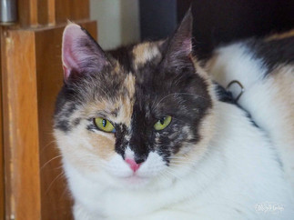


Now how do I draw this kitty in my style? I tend to draw animals realistically for I dislike cartoony creatures. I do like the textures of the fur as well as the patterns of feathers and scales. With Cleo looking flat and borderline Disney princess, Mr. T. might look like he was from another world. But I believed that he WAS from another world. His name alone was not quite Egyptian, which also suggested that this cat was extra special. Argh! I am overthinking this character. "Just draw a cat and make sure you could read his face," I berated myself. I used wet on wet technique with highly pigmented black watercolor and watercolor pencils for the fur texture.

The next two weeks were dedicated to making our characters stronger by getting to know them better. So I drew a lot while deciding on which scene to create for the double page spread assignment. For the poses page, I thought I would create a mural, an homage to the narrative Egyptian wall art. The page would be intricate line art mainly for I did not have this style in my portfolio yet. I would focus on the actions described in the text and Cleo would finally look defeated. Since the page was pale, it would not pop in the gallery for sure but will show some technical chops at a second glance. At this point, I was doing the course my way and was also in the process of signing a representation offer (story here).

Author-Illustrator, a Perfect Marriage
As the course progressed, I finally understood why art directors match the right artist to the manuscript. Author and illustrator is truly a match made in heaven. The stories this year were not for me. I did not feel any spark. But as a professional, I have to see it through and find the joy, that thing that I could relate to in any way. This happens in certain projects and it is fine. Even big time artists who have done numerous books also regret taking on a project while in the middle of it.
What excited me about the story was the environment I would be creating. This is the most fun part in picture book making anyway. I was particularly looking forward to the backdrop setting so I looked for Egyptian patterns and interiors.

Despite gathering so much materials, I still could not decide on which scene to draw and we were on the third week already. In every assignment I have three categories for the treatment of the visuals: Is it going to be obvious, the first thing you would think about? Conceptual or symbolic, a bit more profound? Or radical, thinking out of the box? Sometimes I would brainstorm ideas for each category and tick the box where I would be most excited to create. My brain was already saturated with visual references. To get out of my head, I walked around, took a boat ride, went back to the bookstore, frolicked in the desert sun, took a daily dip into the pool, and finally to change my perspective did headstands and then sat on the floor to do another round of brainstorming to help me find a solution on how to merge my style into this story. I was practically pulling my hair out!


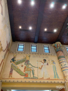
The good thing about living in Dubai is having access to grand interiors with Islamic and Egyptian designs. One mall we frequent for groceries shopping had an entire wing dedicated to Egyptian style and architecture, while another hotel where we dined for Iftar during Ramadan was just screaming majestic ancient Egyptian in every surface. Looking up these mammoth murals and pillars I felt the grandeur of what it was like to live inside Egyptian palaces. What did this inform me? Draw and celebrate the bath scene and so I created two spreads to check my continuity. As soon as I got that scene pinned everything came together easily.

Style Police
I have been collecting picture books especially by artists that I really admire. I also picked up books that caught my attention and those that have special treatments on them like cut-outs and folded double page spreads. I have been studying the styles of different artists particularly those that have been successful. Why am I drawn to Lizbeth Zwerger but also to Oliver Jeffers? To Isabelle Arsenault as well as to Beatrice Alemagna? Why do I love Nakajima Rie’s work as well as Tomoko Nagai? I also loved the looseness of Laura Carlin’s work and the minimalism of Jon Klassen. Though I adored Maurice Sendak’s Where the Wild Things Are, I am not as enamored to Axel Scheffler’s Gruffalo nor to Eric Carle’s The Very Hungry Caterpillar even though I constantly follow their work and words for my own education as an aspiring children’s books author and illustrator. Legendary illustrators of the 1900s Golden Age of illustration such as Kay Nielsen, Audrey Beardsley, Edmund Dulac, Harry Clarke and Arthur Rakham were my ultimate style heroes, which brings me to Gustav Klimt and Alphonse Mucha even though these two were more on the R-rated genre. Likewise Russian and Middle Eastern decorative illustrations and designs were always my reference.

I was beginning to think if I am more meant for middle grade books than picture books. My style seems sophisticated and not age appropriate especially when I look at my first version of Cleopatra. However, people I asked replied otherwise and it was not the case with "Bob" from last year's ICB. Somehow something was not quite in place this time around. As mentioned earlier my health due to my hormone therapy and state of mind during the entire course did not help either for I was experiencing the so-called “impostor syndrome,” which probably began when the agency asked for and reviewed my entire portfolio. I felt that any moment now they would discover that I could not draw and that I was just faking it the whole time. Were these the real cause of my discomfort?
I looked at my artist heroes again and I realized they stood out most because not only did they have a distinctive style but they also had a voice that only they could deliver. Their individual voice was clearly present in their strong and memorable characters but more importantly in their story telling through composition. Their art spoke for themselves and they celebrated their style.

It was a surprise to find my book cover design included in the review and it was rated as a beautiful style of art, comfortable purchase, safe, subtle but a good read with an interesting composition as well as refreshing. I only needed to add a single claw to have that edge. While I was grateful to be reviewed and to know exactly what experts thought of my work, the positive comments somehow made me wonder if I wanted to be safe. I believe I already downplayed myself when I revised my Cleopatra. I remember a concerned comment on my Instagram post of my revised character stating that she thought the first one was more unique and so definitive of my style and it was a shame that the new one has become “Disneyfied.” I still defended my decision due to the technical difficulty of making her less agile with that heavy headdress and that I wanted to see if this kind of “Disneyfied” people would work best with my environment. You know I realized now that she might be right and that I might have played it safe all along. When it comes to your own art, never doubt your instincts, people.
While I was grateful to be reviewed and to know exactly what experts thought of my work, the positive comments somehow made me wonder if I wanted to be safe.
My ultimate goal this year was to concentrate on my style and execution regardless of reviews. I needed to know how to pull off the marriage between decorative patterns and magical realism in this piece and further develop that in my future projects. Of the three manuscripts "Cleopatra and Mr. Tibbles" was the only story where I could apply my techniques but that manuscript had its limitations and did not really allow me to go the extra mile in terms of celebrating my style. I felt I needed to find other stories for my art. I also discovered that I created my best work whenever I wrote my own stories and shrugged off conformity.
On the other hand, I also realized that what I intended to do was not what the story was asking. The story of Cleopatra and Mr. Tibbles was again about finding the connection between the two characters and I failed to focus on that. It was never about ancient Egypt's grandeur nor Cleopatra's awesomeness as a woman. In the end my cover design became my last bid to show that troubled relationship between cat and human and based from the review, I hit the mark this time.
The point of illustrating for children's books is to help the author tell the story to children through visuals and not so much about showcasing the style of the artist even though that gives the book extra appeal. I hyper focused on my style and that is alright, too, because this is education. I signed up to learn.
Appreciation of style is subjective and what one art director or agent might say did not necessarily represent all expert opinions. However it was definitely worth knowing and heeding. I am learning that in the world of picture books, there is room for everyone. You just have to find the right door. My take away from this year’s ICB was that I was clearly marching to the beat of my own drum and I am loving the sound of it despite the self-doubting hiccups. I just need to beat louder so everybody could hear it but first and foremost listen carefully to what the writer is telling.
The point of illustrating for children's books is to help the author tell the story to children through visuals and not so much about showcasing the style of the artist.
NOTE: The text for "Cleopatra and Mr. Tibbles" is copyrighted by Zoë Tucker. All inquiries pertaining to this text must be addressed to her directly or via the Make Art That Sells website.
#childrensbooksillustration #MATSICB #picturebooks
Book mockup designed by Freepik


Comments